Using the right Graphs are very important for representing the right type of data.We can say Data in statistics is of the following types

Different Types of data
For reading the details on all the different data types read here.
https://towardsdatascience.com/data-types-in-statistics-347e152e8bee
For representing categorical data, we use bar charts, pie charts and pareto diagrams(type of chart that contains both bars and a line graph, where individual values are represented in descending order by bars, and the cumulative total is represented by the line.).

Bar charts

Pie charts

Pareto charts
For representing numerical data (basically establishing a relationship b/w two variables), we use histograms, scatterplots etc.

Histograms
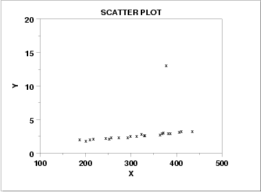
We use Scatter plots when we need to represent two variables in the same graph (for eg. SAT scores of 100 students where x axis represent marks in reading whereas Y axis represent marks in writing).

Scatter plots
Outliers in scatter plots are data points which go against what is norm in scatter plots. (For eg if doing well or doing bad in both reading and writing is the norm, then a person who does well in reading but poorly in writing is an outlier)
Or
Lets say if usually pizza costs between 10-20$ in a city, a place charging 70$ for the same is an outlier.

Outlier in a scatter plot
PS: All pictures correspond to their respective websites.
Link to All Maths 101 posts
0 Comments